
Millipore Design System Rebuild
Overview
In today’s complex life sciences industry, consistent, scalable, and accessible digital products are critical. At Millipore, I worked on improving their comprehensive design system at the end of 2024. This case study outlines the challenges we faced, the process I followed, and the impact our work achieved.
Year
2024
Company
Millipore Sigma
The Challenge
Six months after transitioning from Adobe XD to Figma, Millipore’s design system was already showing signs of strain. Leadership initially resisted updating the component library, but as new projects rolled in, designers were either reinventing components from scratch or breaking existing ones to fit their needs. This led to high-fidelity inconsistencies and additional work, ultimately slowing down the design and development process. Without a structured system, maintaining visual and functional coherence across the platform became an uphill battle.
The challenge was clear: we needed to establish a scalable, well-organized, and maintainable design system that would serve as a single source of truth for both designers and developers. However, since the system had already been in use for six months without governance, standardizing it retroactively was a massive undertaking.


Discovery and Audit Process
The first step was deep discovery. I collaborated closely with the development team to audit existing templates, pages, and components. This process felt like archaeology, uncovering layers of redundant UI elements and design inconsistencies that had accumulated over time. We pulled data from the massive live site and our existing Figma files, identifying inefficiencies and missing elements that were critical to maintaining consistency.
It quickly became clear that our design files lacked structure. Components were scattered across different folders, making them difficult to find. Inconsistencies plagued the live site as designers often created one-off solutions instead of leveraging reusable components. To combat this, I created a detailed audit report that pinpointed missing assets and areas in need of improvement.
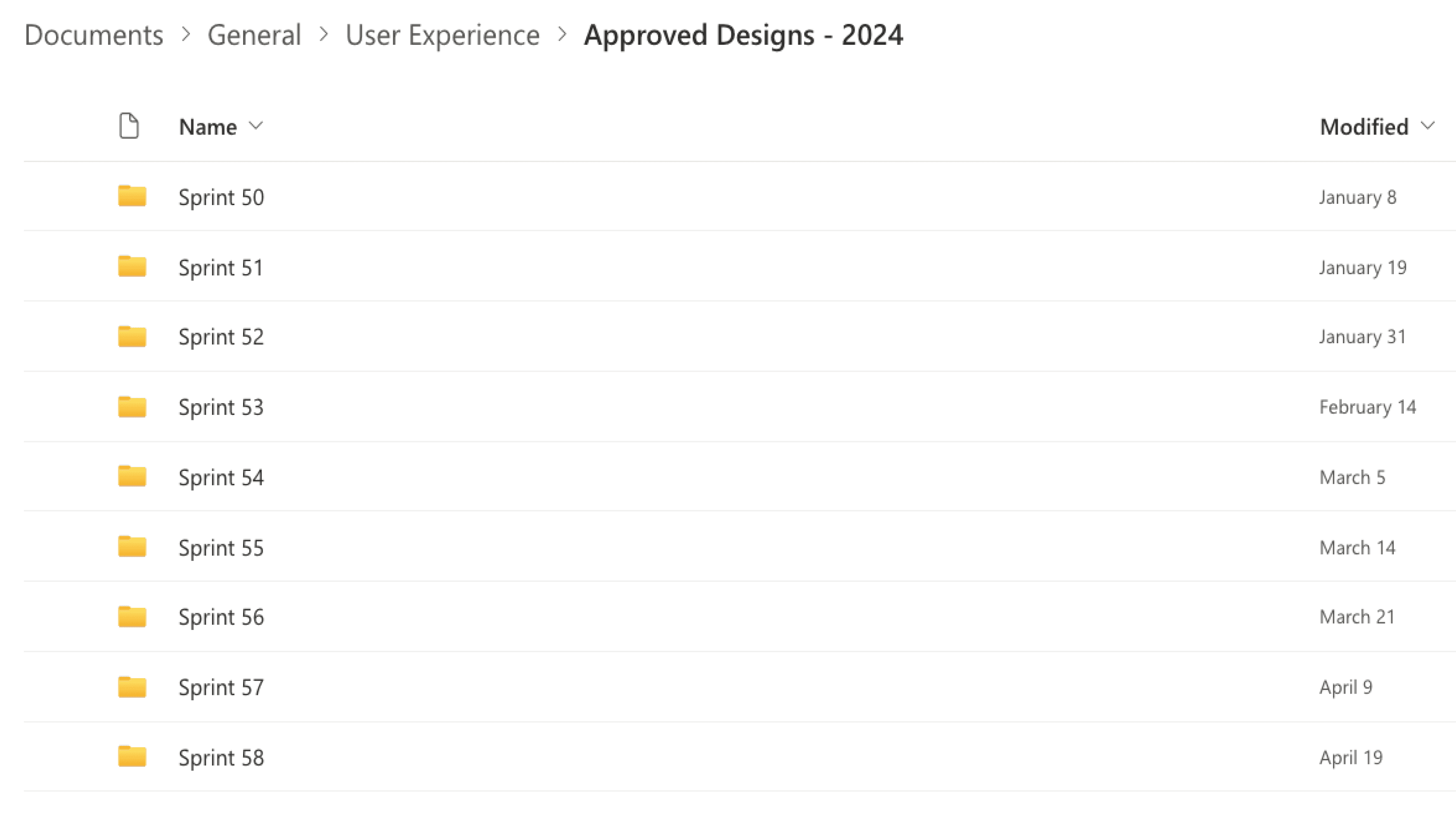
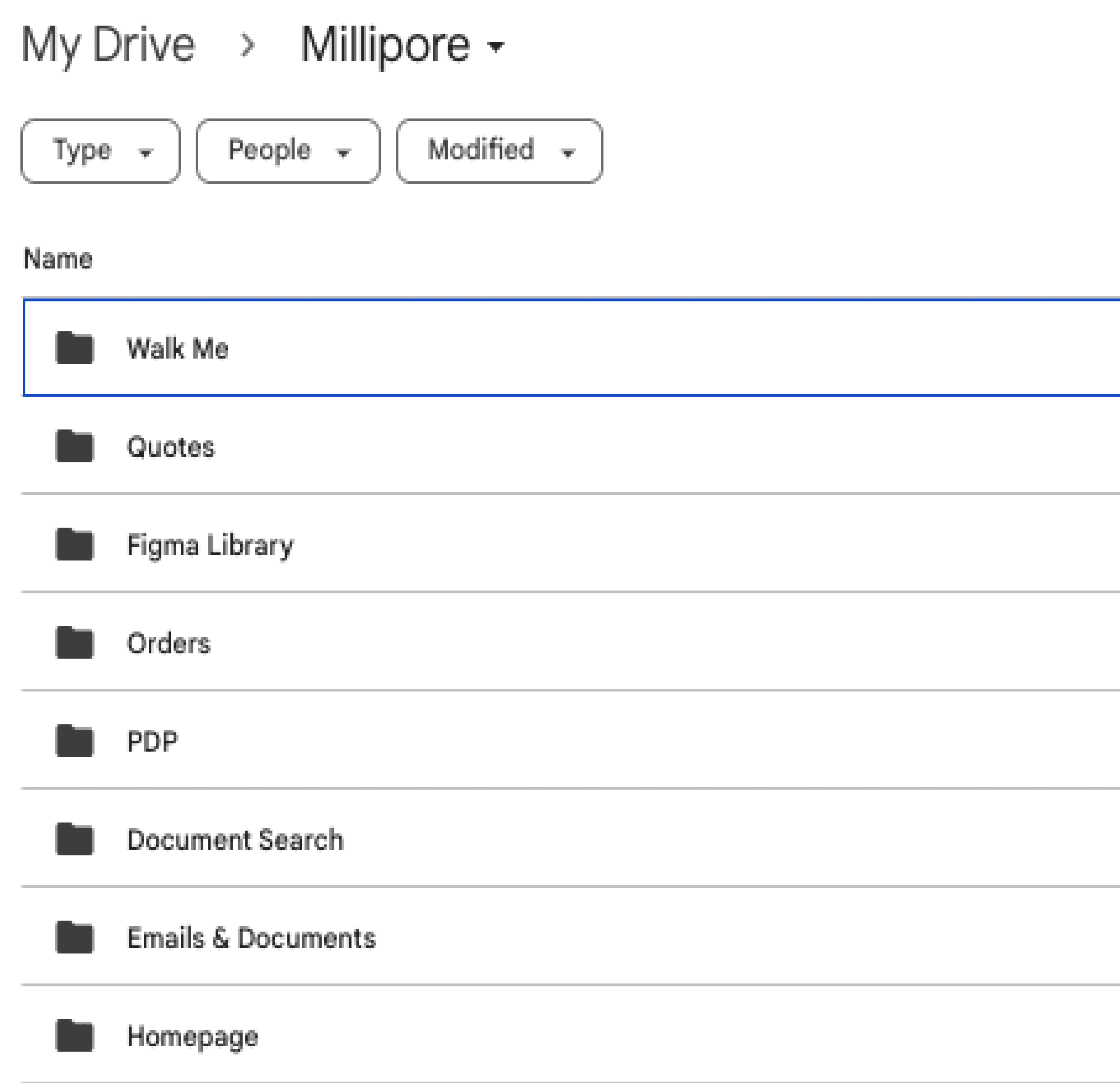
At the same time, I tackled some immediate wins. One of the simplest yet most effective changes was reorganizing our file system in SharePoint. Previously, finding project files was like searching for a needle in a haystack. By reclassifying and labeling folders according to site sections, I eliminated hours of wasted time and ensured designers could access what they needed effortlessly.

Organizing – The Fun Part!
Now came my favorite part—structuring the system for efficiency and usability. To me, this is the part where design systems truly shine.
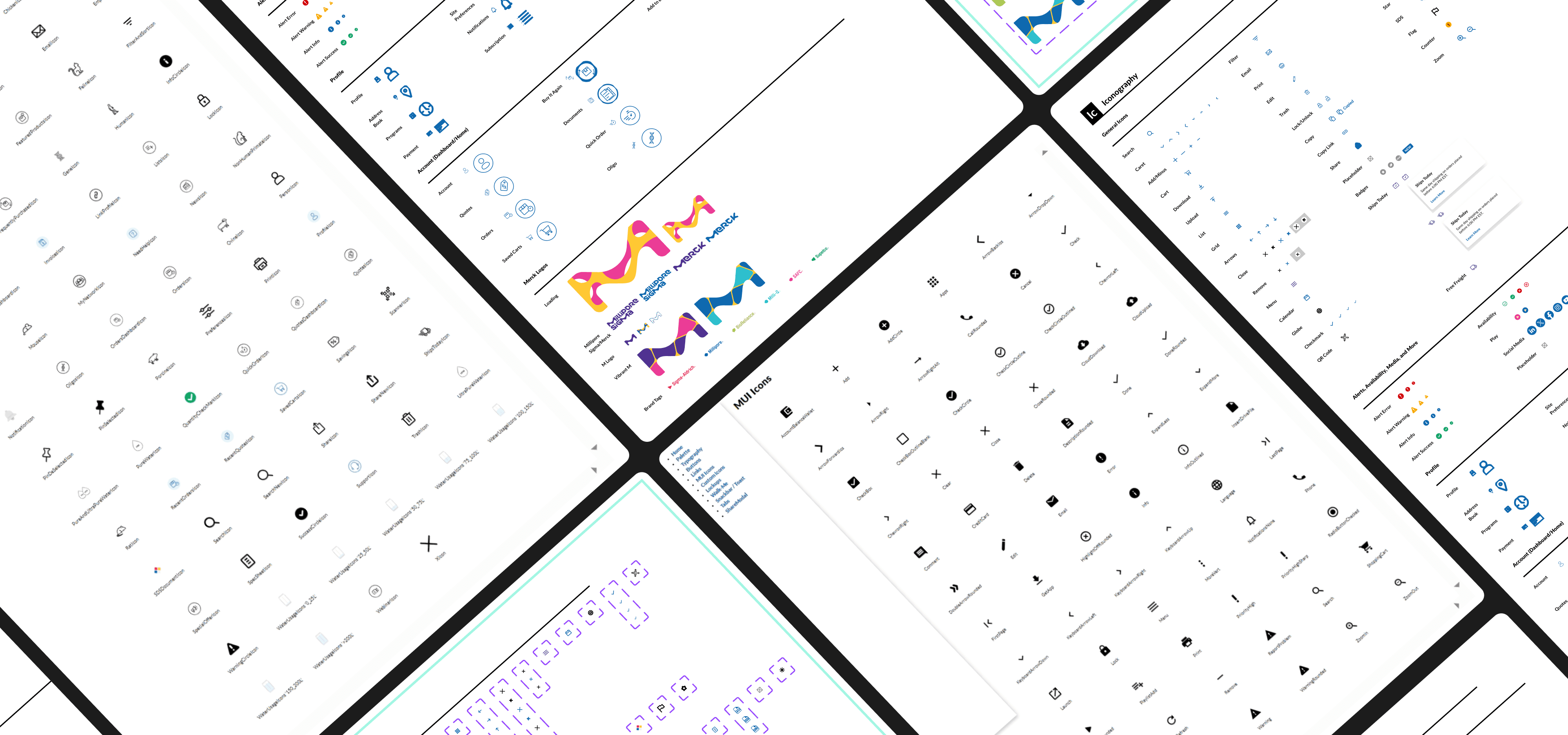
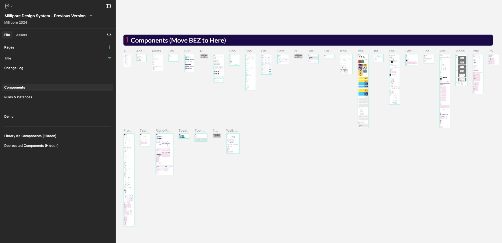
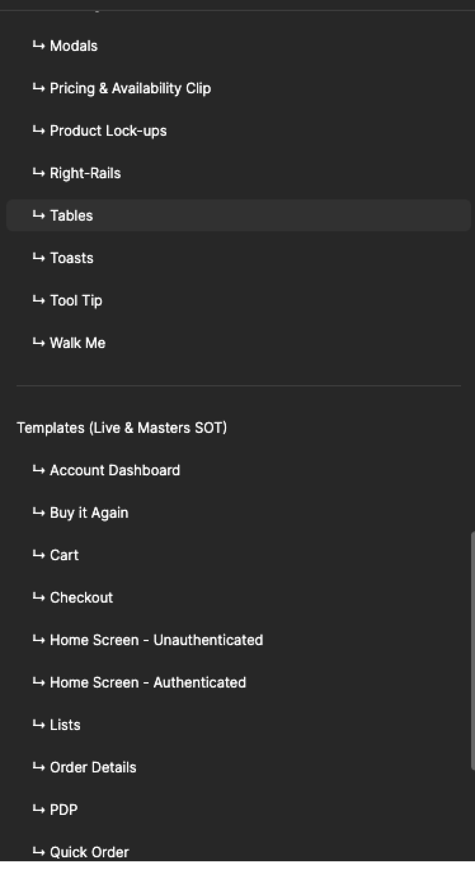
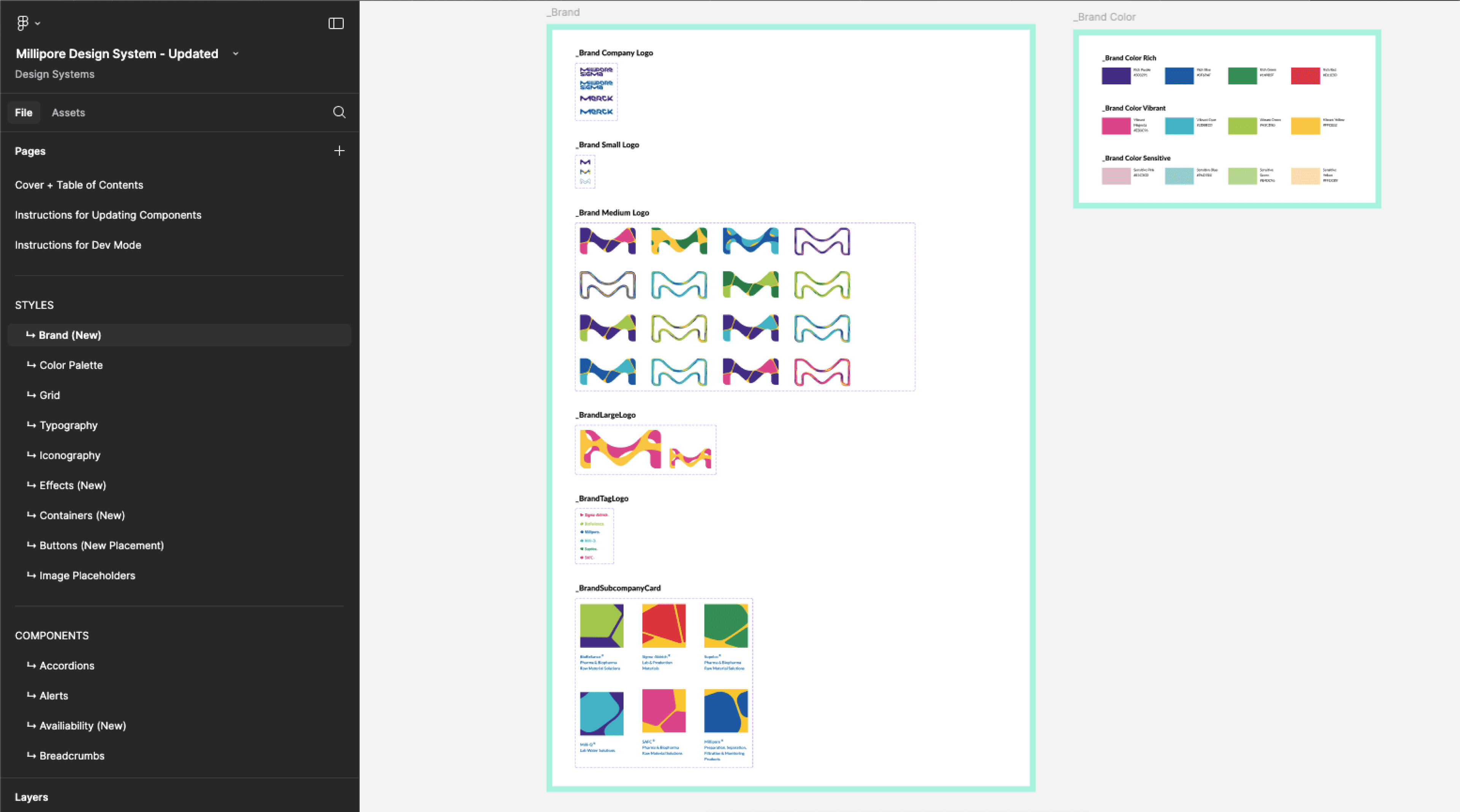
Instead of components being dumped into an alphabetical list, I categorized them by function and use case. I restructured the layers panel to improve visibility and made sure related elements were grouped intuitively. Rules and components, which had been split across separate pages, were merged into a cohesive, easy-to-navigate format.
To ensure updates could be efficiently managed, I established a master page for global updates. No more hunting for the latest changes—everything was accessible in one place. We also created a governance process to ensure ongoing refinement and version control. And to bridge the gap between design and backend work, we updated MUI components to align with our custom brand styles.
What once felt like a fragmented, chaotic system was now an intuitive, well-structured library that designers and developers could trust.
Previous Library
Updated Library


Align – Bridging Design and Development
A design system is only as strong as its adoption. To ensure alignment between stakeholders, developers, and product teams, we held regular meetings to discuss progress throughout the process. However, we dedicated an extra workshop after the discovery and organization phases to ensure that everyone was aligned before moving forward with the definition phase.
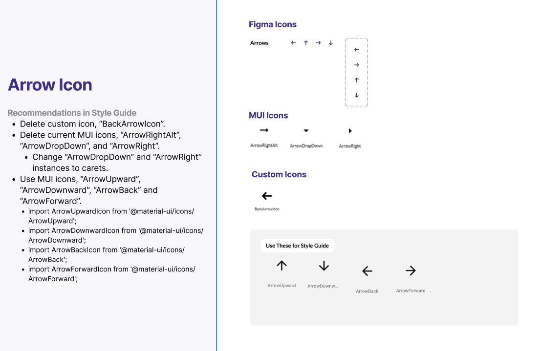
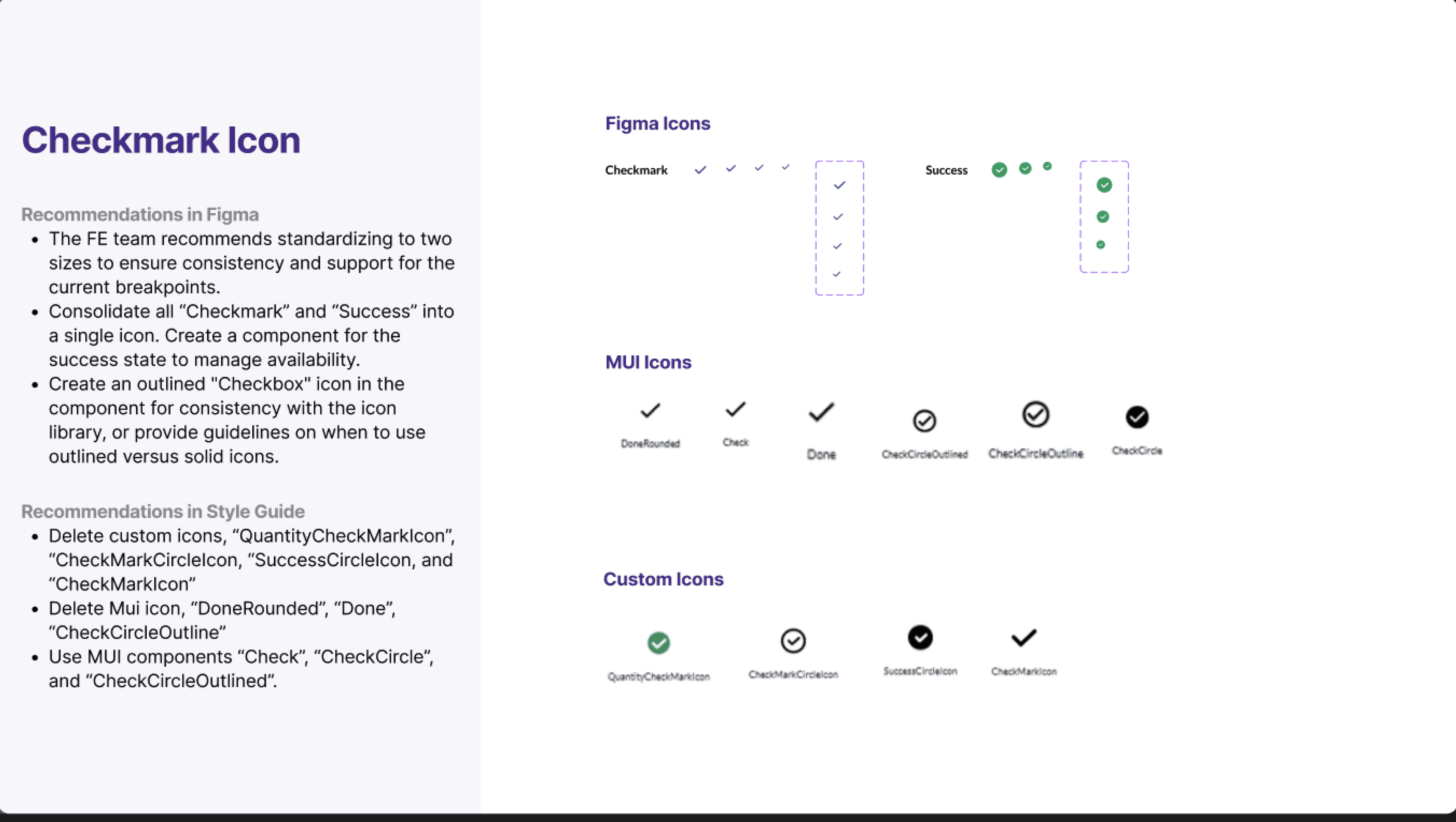
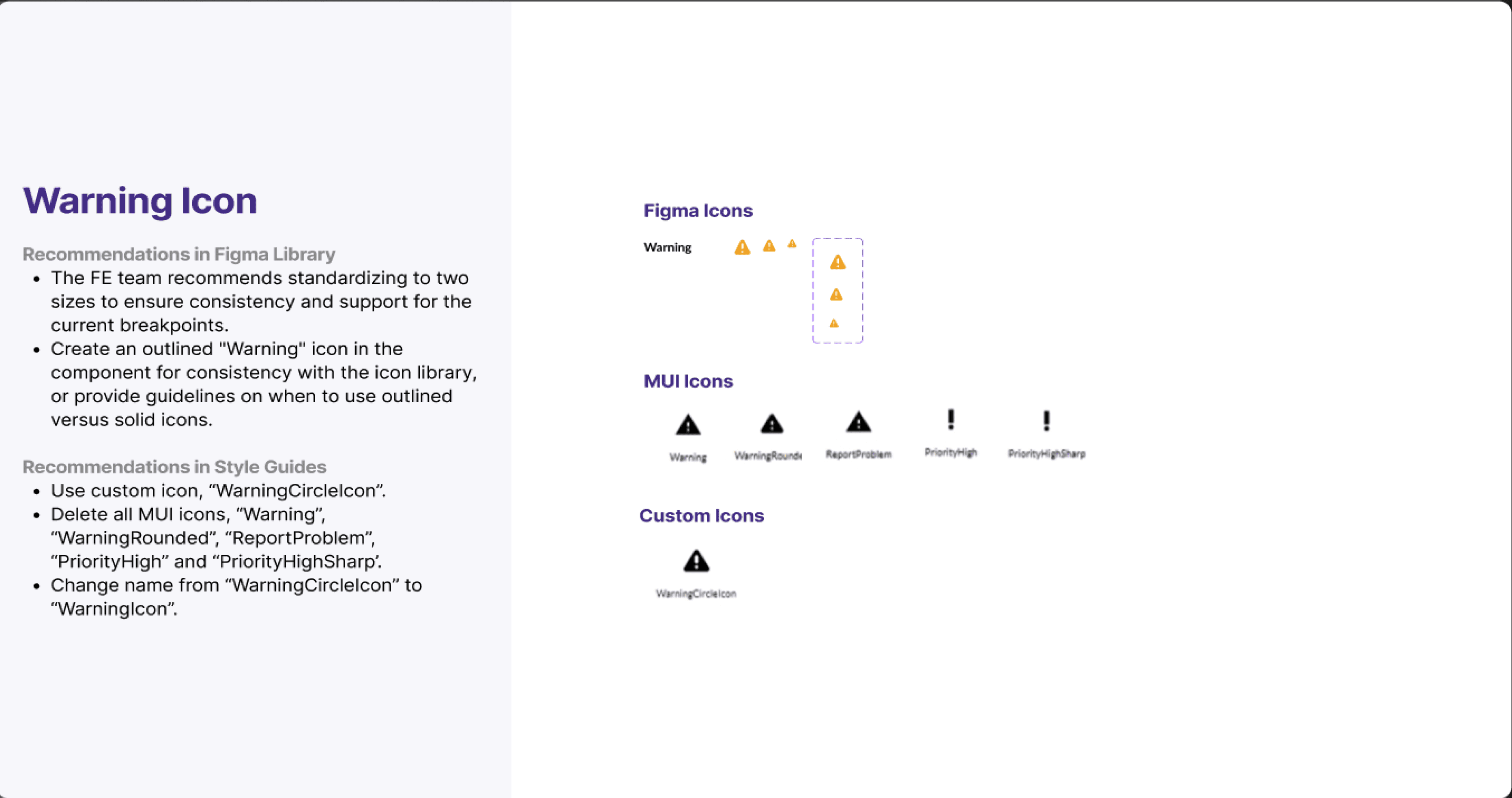
By synchronizing our Figma guidelines with the developer style audit (example below), we were able to make informed decisions on which components to define and refine. We also opted to implement MUI components instead of fully custom builds to enhance backend efficiency. Previously, discrepancies between design and development led to time-consuming troubleshooting. Now, with everyone working from a unified source of truth, the process is more streamlined and cohesive.
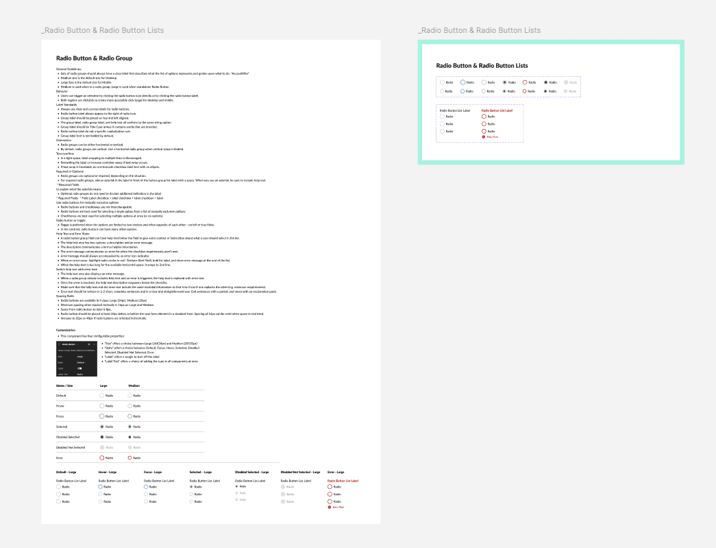
Define – Establishing Consistency and Efficiency
Now that everything is aligned and organized, it’s time to define our library:
Establish Standards: Set governance, states, and accessibility requirements for each component.
Create Usage Guidelines: Specify when and how to use each component, with alignment, placement, and content examples.
Document Design Behavior: Include error states, interaction patterns, animations, and responsive behaviors.
Centralize Revisions: Keep everything up to date with a master page for component revisions.
Display Visual Styles: Show rules and examples to ensure consistency.
Responsive Design: Add mobile and desktop specs, and create prototypes where necessary.
These steps resulted in a cohesive design system that improved collaboration and streamlined our workflow.
Maintain – Ensuring Long-Term Success
A design system is never truly ‘done.’ Without proper maintenance, even the best systems can fall apart. To ensure long-term success, we put a maintenance plan in place.
Regular audits became a key part of our workflow, with scheduled reviews to keep the system aligned with live components. We built scalability tools to allow for easy expansion, ensuring that new components and variants could be introduced without disrupting the system. A dedicated maintenance team was assigned to manage updates, and a feedback channel was implemented, allowing designers to request changes as needed.
By treating the design system as a living, evolving entity, we ensured it would continue to serve the needs of both designers and developers for years to come.
The Outcome
The impact of our design system rebuild was undeniable. Designers and developers saved hours each week, no longer bogged down by searching for assets or troubleshooting inconsistencies. A unified system meant fewer visual discrepancies across projects. And most importantly, the structured approach enabled seamless future growth, ensuring that Millipore’s digital products could scale efficiently.
Through this process, I was reminded why I love design systems so much. There’s something incredibly satisfying about bringing order to chaos, creating a framework that empowers teams to work smarter and faster. And honestly? I had an absolute blast doing it.